Kingham Plough  30/05/10

Went to a sort of village fayre / farmers market / family fun day at the Kingham Plough in kingham near Chipping Norton, with my Aunt and Uncle who live nearby. It was a fantastic day with all sorts of local produce and local beers and ales on sale and farm animals to pet for the kiddies and a hog roast (which I did find slightly sinister actually: pet the piglets and then tuck in to their mum!!). there was one stall in particular which caught my interest which was selling wild salad mixes and wild foods and drinks. had a look at the stall, then there was a small talk given by Yun Hider who was talking about foraging and trying to encourage people to use wild products in their day to day lives, like people did 50 odd years ago. nettle tea/ nettle soup / beech leaf noyau /hawthorn / wild fennel / wild garlic / sea breem were all mentioned, and Yun encouraged everyone to try all the ingredients he was talking about. They actually tasted good and I liked the idea of  using wild products, the only problem I found with the idea is that the majority of these ingredients are supplements to meals or garnishes rather than forming a major part of any meal. Yun, however provides ingredients to various restaurants, pubs, and chefs and even provided ingredients for a meal for the Queen. The pub which the event was held at - The Kingham Plough, has a very well renowned restuarant and it's chef / propreitor Emily Watkins works the wild produce provided by Yun into the ever changing menu; it was interesting to hear the talk and then see how the ingredients are worked into a menu inside the pub - it all sounded delicious! 
Its a nice way to encourage more people to engage in the landscape and to use it in their day to day lives; it has a similar kind of ethics / ideals as the 'grow your own' schemes which are becoming popular and I think it could have the scope to form community projects etc. The whole idea of using the landscape has always interested me and edible landscapes are the obvious direction ; however urban farming initiatives  and grow your own schemes are becoming more and more common and popular and I think this wild food foraging is an exciting way of collecting food from the landscape which has been overlooked in recent decades and is due for revival. 

Below is a video of Yun giving a similar talk to the one which I attended.


Oxford Brookes Architecture Exhibition
28th May 2010

I went to the end of year exhibition at Oxford brookes University where my sister, Amy is studying for a Diploma in Architecture for part 2 accreditation from RIBA / ARB. All levels of Archiecture students were exhibited on different floors and the third year undergrads and first year diploma students were the most impressive. The first year diploma students were split into units of roughly 15-20 students and each unit tackled a different issue. The unit I focused on duriong the exhibition was DS2 Place-nomics, which looked at solutions to social problems and the downfalls architects are currently suffereing as a result of ignoring the real needs of communities and environments. This was the unit Amy studied in and her work focused on community housing around a theatre. The work was very impressive and beautifully and very imaginativly exhibited. For example the DS2 unit chose to display each individuals work in an A1 strip from floor to ceiling with a blind covering the entire length which had major facts and information effecting the project printed onto it, as you read the facts and lifted the blind the work was revealed. There were many beautiful models, a model for one unit was created of the whole area but visitors to the exhibition could chose which project from the unit to place on the site. There was another whivh had each project projected onto the site with shadows showing the passing of a day, each day there would be someone elses project displayed.

It was quite an imtimidating exhibition to go to only a week before your own Landscape Architecture exhibition opened!!

Design Museum 22 May

Visited the design museum to finnally see the Brit Insurance Designs of the Year 2010, and also the David Adjaye exhibition on Urbanisation in Africa. The Insurance Design exhibition was really interesting. The winning design - the foldable plug by Min-kyu Choi, was impressive. The UK plug is something which is so unescessarily bulky and cumbersome, but also tolerated without question in day to day life, so to create such a simple and user friendly solution, I think, was very clever. Other designs which I was impressed / inspired by include, a product called 'clouds' which is an installation / starage / furniture / partition wall combo creation, by Ronan and Erwan Bouroullec for Kvadrat. Basically a series of cells constructed from felt and connected together with custom fit elastic bands. the beautiful thing about the product is that the form and size of the 'cloud' is entirely down to the individual user. I really enjoyed the creation of something beautiful which can also be unique to everyone. Also the nominees for the interactive award were interesting and often alot of fun! Bloom (by Brian Eno and Peter Chilvers), which is an iphone / ipod touch application design was fun. the idea was to create music compositions by touching the screen in different places, this also created a ripple effect visual and when the application was left idle it would repeat the most recently entered composition on a loop. The BMW concept design was fascinating but with the desciption of its fantastic ergonomic form and unusual material, and also the surreal aesthetic; all you wanted to do was have a touch - and you obviously (but dissapointingly) weren't allowed. The most beautiful intallation I saw during the exhibition was without doubt 'Soma' by Ayala Serfaty. It was a light intallation constructed of light filaments which are woven together and then sprayed with polymer to create a glowing skin-like crust.

(Below: Folding plug design by Min-Kyu Choi, Cloud by
Ronan and Erwan Bouroullec for Kvadrat, Soma by Ayala Serfaty)

I was surprisied to see the Highline project as a nominee for the architecture award, only because it feels like its been around longer than it actually has, I think. Where it was maybe under celebrated in the Brity Insurance Design Awards, it has now made it up by winning a D&AD 'black pencil' award in the environmental design category.

LINK to D&AD website


I then went on to see the also long awaited David Adjaye Urban Africa exhibition. The introduction to the project was really interesting. Different characteristics of each African country were shown through mapping the whole continent in different styles. Giving you as the viewer an opportunity to understand each individaul country in the context of the Afican Continent. However when I moved into the exhibition I was slightly dissapointed. Each capital city in the whole continent was represented through a series of photographs, intended to encapture the feel of the whole city and the urban context of each city. I felt a little let down, and I don't really know why - the few Cities in Africa which I have visited and were represented, were represented well by the photographs. I think I was just expecting more analysis, more of a study.


Roadmap 2050 / Office of Metropolitan Architecture / Rem Koolhaus


I read a really interesting story in the newspaper recently about the Office of Metropolitan Architecture (created by Rem Koolhaus) which has come up with a re design for the whole infrastructure of Europe, to share  renewable energy, in a grid system.

"The proposal's starting point is the fact that renewable energy sources such as wind and sunshine are erratic and unreliable, which means they have to be supported by other forms of power. But they are also available in different quantities in different places – wind is abundant in Britain, sun in Spain – and in different seasons. The big idea is to create a power network across the continent linking all these sources, which could then compensate for each other. If it was windless in Britain but sunny in Spain, power could travel from them to us, and vice versa.
This is a political, as well as a technical proposal. "You can use this project to create integration. It creates a very pragmatic reason to integrate," says De Graaf. It coincides with work the OMA has been doing for several years on the ways that the European Union represents itself, through their design and research subsidiary AMO, which "operates in areas beyond the traditional boundaries of architecture". Koolhaas is a member of the EU's Reflection Group, whose job is to think about what might happen a decade or two hence."


"Stanton Williams has won an international competition to design the new £6m public square in front of King’s Cross station in London."


The winners of the redesign of Kings Cross station have been announced as Stanton Williams. the square is 7000 metres squared, and part of the £500 million regeneration of the station, due for completion in 2013. Kings cross station is relevant to one of my third year projects; the brief of which was the redesign of Camley Street Nature Reserve, so the redevelopement of the station forecourt was of particular interest to me - i look forward to seeing it.

Link to Landscape Institute web site
Serpentine Pavillion 2010

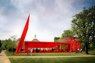
French architect Jean Nouvel has been asked to design this years Serpentine Pavillion (a temporary pavillion which is designed by a different architect each year since 2000, often an architect who has not had the opportunity to have anything built in the UK before). The proposal (below) is intended to refer to classic british icons, such as the route master buses / red telephone boxes / post boxes. The materials, glass, steel, fabric and polycarbonate, are also inteded to reflect this concept. The pavillion declares it's presence in Hyde park through it's vibrant colour and a 14m free standing wall next to the building.

below - video about previous Pavillions from different architects over the years.

Dilston Grove Arts Venue

Dilston Church is due to reopen it's doors as a contemporary arts venue at an opening event on the 27 may, after two years and £870 000. The building is a grade two listed church and has hosted exhibits by various artists before, including; Ackroyd & Harvey, Richard Wilson, Mike Nelson and Shauna Illingworth.


2010   ASLA   Proffesional   Awards

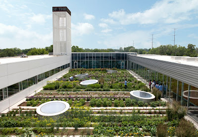
"The Gary Comer Youth Center Roof Garden is an after-school learning space for youth and seniors in a neighborhood with little access to safe outdoor environments. Last year alone, it produced over 1,000 pounds of organic food used by students, local restaurants and the center's café. Sleek and graphic, it turns the typical working vegetable garden into a place of beauty and respite."

Winner of the Honor award one of the ASLA (American Society of landscape Architects) professional awards 2010. This rooftop system was designed by Hoerr Schaudt Landscape Architects with john Ronan (architect). It was commended by the jury for being . .  . so simple and straightfroward and is clearly a good collabiration between landscape architect and architect. it is redeeming."

Other designs which won awards during the ASLA professional awards which i found particuarly interesting are: Resuscitating the Fez River (Fez Morrocco By Bureau E.A.S.T.), Park 20/20: A Cradle to Cradle Inspired Master Plan (Haarlemmermeer, Netherlands By William McDonough +Partners),  The Qinhuangdao Beach Restoration: An Ecological Surgery (Qinhuangdao City, Hebei Province, China By Turenscape), San Francisco Residence (San Francisco USA By Lutsko Associates, Landscape) and also The Sungei Buloh Wetland Reserve Master Plan (Lim Chu Kang, Northern Singapore By National Parks Board). This project was of particular interest to me presently as i am currently bringing together a masterplan document as part of my course, so i found the project quite inspiring. the main aim of the masterplan is to move the wetland reserve from a Nature Park to that of a regional education and research facility, while retaining the iconic rustic charm. the project was beautifully put together and was commended by the jury for it's exceptional graphics. “ A Great plan with bold graphic presentation that envisions a wetland reserve as economic and cultural amenity- it's an exciting vision that has a believable solution We hope that projects like this can be built!"
Above: One of the images used in the presentation of the The Sungei Buloh Wetland Reserve Master Plan


Waterperry Gardens 
May 1st 2010
Waterperry house and gardens, in oxfordshire which was originally home to the Horticultural College between 1932 and 1971 the gardens are really beautiful and a lot of the border planting particuarly is reminiscent of the arts and crafts movement / painterly style borders of Gertrude Jekyll. Mary spiller is the design consultant responsible for the majority of the design of the gardens, having herself graduated from the school to become a teacher, horticultural manager and then head gardener before her current design role.

 I really appreciated the gentle painterly approach to the design of the garden, particularly the Mary Rose gardens, (which were planted in 1991 and are now well established and flourishing) and  the canal and surrounding area. the canal is a strip of water (probably better described as a sort of rectangular pond) which joins the herbacious nursery to 'Mirandas border'. It is cleverly designed to allow the clear vista from the top lawn over the countryside to remain, whilt still being a beautiuful and interesting feature in itself. In the centre of the canal stands a statue of Miranda from Shakespeare's 'Tempest' sculpted by Tanya Russel, it is elegant and eautiful and seems to fit the aesthetic of the garden well. The formal gradens were also very interesting, based (loosely) on a Tudor garden, it comprises of plants which might have been found in gardens from multiple eras including Tudor, Stuart, Georgian and Victorian, and also has a sculpture of a girl holding the 'lamp of wisdom'.
I thoroughly enjoyed the gardens and found them very therapeutic and relaxing.


Annecy  - 17 / 04 / 2010

Visit to Annecy at during the penultimate week of the 09/10 ski season. It was very strange to be in the Alps at this time of year as the pistes in the resorts were still snowy but out of the ski resorts it was completely bare of snow and very sunny! The landscape around the Lake Annecy was really interesting to see. A lot of the land directly next to the lake is privately owned, so the public parks almost compete with the privately owned land in upkeep and design. The parks next to the lake are extremely well used (most probably due to their astoundingly beautiful location and the beautiful weather) and are very well kept. The majority of the trees surrounding the lake are pollarded, which looks a little odd in such an impressive natural setting - almost like the trees are the one piece of nature that can be controlled! I also felt however that the trees take on a bizarre sculptural aspect, with there bare nobbly forms. 


The New Faces: a Photographic Exhibition  

At The Book Club. It was a series of protraits and photographs by Dean Chalkney. I really liked the laid back style of the photos, and the moments which were caught seemed natural and yet well orchistrated.


"All the participants are in their late teens or early twenties, trying hard to be 'faces' on today's mod scene. Dean first encountered them last summer when they dropped into his monthly night club in north London. They would appear, dance and, after a few visits, even DJ. He became fascinated by their moves and by their style and the idea for 'The New Faces' was born"


April / 2010

From a very cool little book called Visual aid2 - you can never know enough stuff by Draught Associates / Black Dog Publishing. The book is just full of trivia which is presented really beautifully with simple stylised graphics, to allow visual learners to pick things up easier. other examples of contents are: toasts in different languages, composition of the human body, bridge types, bats /sticks /racquets, palmistry, extinct animals, and many many more. I really enjoy the bold graphics, and the use of diagrammatic information and ways of using diagrams to represent what otherwise would be described in writing. I think this technique is underrated and underused in day to day life; obviously designers / architects and landscape architects are constantly using this technique and i found it really interesting to see it used for things which usually would be in writing.

An article in the Evening Standard about an art installation opening at the Bargehouse on Southbank from 9th April. It is called Speed of Light and is to celebrate the 10th anniversy of broadband. (By collective United Visual Artists and comissioned by Virgin Media). Looks really interesting; i can't find any further information about it, so i'm looking forward to it - I have in mind Leo Villareal style lighting effects / works. should be good.

The Real Van Gogh - The artist and his letters
20 / 03 / 2010

"They say a picture is worth a thousand words, yet in ‘The Real Van Gogh: The Artist and His Letters’ words redefine our understanding and appreciation of one of the most revered figures in the Post-Impressionist movement. Through the juxtaposition of Van Gogh's letters and his art, we see his life, work and passions illuminated as never before."

The exhibition was at the Royal academy of Arts. It was an amazing exhibition which really gave insight into what Van Gogh was all about. it was fascinating to me to see how he struggled with perspective for so long and it was interesting to see the progression through his work, as you walked through the exhibition. I found the earlier pieces of work sometimes very crude  (mainly the perspective paintings in oil), and often beautiful in an almost romantic way (ink sketches and line drawings on a plain background). the later work where he really embraced colour were fantastic. I was so glad to finally see some. Among my favourites was "sower with setting sun" (below); the colours were almost luminous, the green was so vibrant against the purple fields. Another favourite was the sunflowers, as i used sunflowers among other organic forms in my art at sixth form and on my art foundation at Norwich. The colours were really beautiful which made me realise how badly most of the paintings reproduce - they were all far more beautiful in reality. Some of the colours eg. bright pink have faded over time to almost white (eg. below in "blossoming Almond tree"; the blossom were originally a much brighter pink).

Above: Blossoming Almond Tree, (Feb 1890) Vincent Van Gogh Below: Sowers with Setting Sun, (nov 1888) Vincent Van Gogh
I did enjoy letter aspect of the exhibition; although most were in dutch and french they were often illustrated with rough sketches of whichever painting he was working on at the time. These sketches, which he referred to as 'croquis' or 'scratches', were beautiful, and with a few of his earlier pieces I actually preferred them to the painting itself. Most of the letters were addressed to his younger brother Theo (an art dealer who supported Van Gogh financially and morally throughout his career) other letters were addressed to his younger sister Willemien and artist friends Anthon van Rappard, Paul Gauguin and Emile Bernard. 


Sir John Soanes Museum - 20th march 2010


"Soane was born in 1753, the son of a bricklayer, and died after a long and distinguished career, in 1837.

Soane designed this house to live in, but also as a setting for his antiquities and his works of art. After the death of his wife (1815), he lived here alone, constantly adding to and rearranging his collections. Having been deeply disappointed by the conduct of his two sons, one of whom survived him, he determined to establish the house as a museum to which 'amateurs and students' should have access. "


The second time i have visited, but i found it just as fascinating as the first time. The amount of things in the house and the architecture of the house itself is staggering. I am always most impressed by the sarcophagus of Seti I. I just find it so bazaar and fascinating that a house can have such precious things in it.


marks hall  -  06 / 03 / 10. Walk around Marks Hall in Essex. The planting was very beautiful in places, next to the lake birches and red barked dogwood are planted, which contrast beautifully with each other and are reflected in the water. In the woodland snow drops were out as where wood anamones and celendines.

"The Walled Garden covers two acres and was built in the C18th. It is unusual in that it is open to the lake on one side. Once completely overgrown and neglected the Trust decided to mark the 100th anniversary of Mr. Phillps Price’s acquisition of Marks Hall by creating a contemporary series of gardens to make this the summer focal point of the Arboretum. The magnificent double border is nearly 450 feet long and the five terraced gardens are designed to appeal to all ages with vibrant planting, which provides a procession of colour throughout the summer. The Duchess of Devonshire officially opened the Walled Garden on 1st July 2003."

The walled garden in winter.

Betula utilis and cornus alba, next to the lake. the contrasting colours really work together.
The walled garden was closed when we went for maintenance work. It is closed every winter as the planting is supposed to be purely intended for the summer. However we took a quick peek and I thought it was a real shame to write it off for half of the year. The beech hedges keep movement texture and some colour the garden and the sinuous curving walls reflect the silver winter light beautifully. I really enjoyed the visit especially after having been in the city for so long - you can really appreciate the changes in seasons in the country.


Time lapse similar to the time lapse of japanese knotweed i found on the BBC website. I love the way you can see the days going by, by the shadows. For my final in art foundation I was looking at the way things grow, and I planted beans in a custom made perspex box, so you could see the growth of roots and leaves. In the final exhibition I displayed the perspex box with five canvases and three pint glasses with conkers at different rates of growth. I found the project very interesting.


05 - February - 2010

Brit Insurance Design of the Year 2010 winner was MIn-Kyu Choi with his Folding Plug. below video for 2009 Brit insurance design of the year (winner - unofficial Barack Obama poster, by Shepard Fairey.) Below Alex Newson, the curator of the exhibition at the Design Museum, walks through the exhibition.


Insect that fights Japanese knotweed to be released
"A tiny Japanese insect that could help the fight against an aggressive superweed has been given the go-ahead for a trial release in England."

http://news.bbc.co.uk/1/hi/8555378.stm


BBC story about the introduction of a bug which kills japanese knotweed, which has become a major problem in the UK. I came across it during a project on the Wey and Arun canal where it was colonizing in the closed canals. On the website is a very cool time lapse video showing Japanese knotweed growing over 1m tall in only 3 weeks.

Ecobuild 2010
Earls court.

The usual products were on display this year, and I didn't spend long in the main hall, looking around. I did attend several interesting seminars though, including a series on  Urban planning and the public Realm. This included a series on the following: 'Making space for food', 'Incorporating trees' and 'Can healthier environments be designed?'
 Martin Kelly, managing director of  Capita Lovejoy chaired the series called 'Incorporating trees' which was interesting as he came to give talks on the same subject during a focus week at university, which I found really compelling. I am finding more and more that trees are a major consideration I have whilst designing a Landscape, and that there importance is becoming something that I am quite passionate about. 

"Trees are widely understood to be central to a better environment, and this seminar explores concerns and practicalways to include more trees in urban and peripheral environments, how they can mitigate urban heating, and how to manage their ongoing maintenance."  

The other Lectures which really had an impact where the series called 'Can healthier environments be designed?' in particular a seminar given by Rachel Hine, who is the Assistant Director, Interdisciplinary Centre for Environment and Society, University of Essex. She spoke about The therapeutic effect of nature, and the impacts on mental health, which is very relevant for me, as the title of the CS Essay (dissertation) I am writing at the moment is: Ecopsychology; The effect of nature and Landscape architecture on the human psyche. The research that has been done at the University of Essex by Rachel Hine is really interesting. What really interests me is the suprisingly strong correlation between the decrease in mental health in the UK and the rate of Urbanisation, indicating that people are healthier if they have easy access to green space.


Dusseldorf 
24 - 27 Feb 2010

I went to Dusseldorf to meet James (my boyfriend) for the end of Depeche Mode's  'tour of the universe', which he has been working on for the past few months. I was interested to visit Germany again as the only other time I have spent there was back in  the summer of 2005, when I spent some time in Munich. It was also an interesting visit for me to see the relationship the city shares with the Rhein (at university at the moment the focus of our main project is the river Thames and the relationship it shares with London and other settlements along it).

On the first morning i headed straight into the alt stadt which was very close to the hotel, and also runs along the edge of the river. The old town was quaint but the river edge was what i found interesting from a landscape perspective. The banks were wide and used as public space, the major use of the river for industry was apparent, but this didn't seem to stop the river being enjoyed by the general public, for leisure too. The Rhein is one of the major rivers in europe and is used in the area around Dusseldorf (lower Rhein) for transporting goods and industrial purposes, there are many plants and factories to be found on the banks around this area. Duisberg which is just up river from Dusseldorf has Europes biggest inland Port, acting as a hub for rotterdam, Anterp and Amsterdam sea ports. So you can see from the river edge a steady flow of goods carrying boats and barges on the river. The river edge still had the 'sea wall' type barriers and walls for flood prevention etc. which is what I felt so separated the town and the river at Gravesend (where the site is for my university project), however the use of wide spaces either side of the river for public use seemed to break down the 'barriers' and draw attention away from that boundary, so it almost was not a boundary any longer. There was a large stretch of the river which had restaurants and bars fronting straight onto it; this was fairly quiet when I went but I imagine gets very busy in better weather. This too draws people to the river and emphasises the fact that the river is something to be celebrated rather than hidden away. 

One of the main things I noticed which was used in a few public squares and along walkways along the river was avenues of pleached trees. It is something that I haven't seen used in public space often before and the effect in some areas was really pleasant. It gave the feel that the space was well looked after and managed, and it also gave direction to linear spaces without creating too much of a barrier.


Above: a square in das altstadt
below: pleated trees along the river front. Above: pretty facades in das altstadt

The final two shows of the Tour of the Universe, where fairly epic. I have seen the show before at the 02 in London, and was impressed by the graphics, videos and lights the first time i saw it. It really hit me how much of an impact good design has on most aspects of modern life. 


Photos from the last two shows of depecjed mode's Tour of the Universe, at the Espirit staduim in Dusseldorf.