Showing posts with label Detailing. Show all posts

South Kensington  - 17th February 2010
Tree management in South Kensington. Interesting (after looking into landscape management) to see the trees in before and after stages of being pollarded. Pollarding of tree avenues is very common especially in urban situations, these are Platinus Hispanica (London plane) again very common for use in avenues in urban situations and a tree which responds well to pollarding.

New entrance to Burgess Park.
Friday 5th February 2010

The new entrance for Burgess park is intended to link up the soon to be redeveloped park and the also soon to be redeveloped Aylesbury Estate. I was taken on a tour of the site on the 14th January by Richard Peckam, so to see how the site has taken shape over the past month was really interesting. The turf has now been laid so the form of the site now is a beautifully undulating green landscape with play equipment and access paths tucked neatly between and amongst the mounds and dips. It was really nice to see some change finally to an area which has been promised redevelopment for a while. It was good to see how a construction site developes and also put a time scale to it. The last time i visited the site the form of the mounds was there but the turf had not been laid, there was a lack of furniture and a fencing the first time round which was present this time. It looks very close to finish now and i really like the finished effect. 


Photos i took peering through the fence at the site.


Site tour of the new entrance to Burgess Park 

14th january 2010

The new entrance for Burgess park is intended to link up the soon to be redeveloped park and the also soon to be redeveloped Aylesbury Estate. The entrance is along the northern edge of the park and is in line with Chumleigh Gardens, the only remaining buildings in Burgess Park which was once a hub of industrial and residential infrastructure with important transport links. The design of the area was based on being a playful landscape and involves triangular segments of land with the pathways running through them, which are shaped as mounds or troughs alternatively. There is a playground in the area which fits into the undulating landscape. I went with a small group of students to visit the site, which is in its final stages of construction. Richard Peckam, from Shape Landscape Architects, gave us a tour of the site focusing especially on the detailing and what has to be specified where. It was fascinating to see the site at this point and to realise the exact amount of detail which is required in drawing for construction. There were a few aspects around the site which Richard pointed out as being things which weren't quite to his liking, or not what he'd imagined, which he then went on to explain that the detailing for that piece was not detailed enough or slightly wrong etc. 
  Walking around the site also made me realise how much the client or the brief dictates some of the design, for example, there was a need for vehicular access through the site, which had to be accommodated for. Another example of this would be the fact that the playground had to be dog-proof, so fenced off, therefore creating a harsh boundary, which was delt with is an interesting and asthetically pleasing way in this case. Part of the boundary was taken up by a custom built high backed bench, which was shaped in such a way that you could site on both sides of the boundary.
 I was suprised by the amount of work and detailing which has to go into absolutely everything on the site, and it was very interesting to hear from someone who was working on the project what he thought had gone well and vice versa.


Photos of the site, showing how the newley created contours provide an area for play. Also showing the double sided dog proof bench.  

Barcelona
19th November 2009

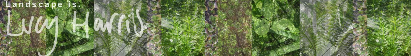
Park Guell was where we started today. Designated a UNESCO world heritage site, it is a stunning piece of work by Antoni Gaudi and a unique example of Art Nouveau landscape architecture. The situation of the park on the hill el Carmel in the Gracia district of Barcelona means the views across the city towards the sea are beautiful. The site was initially intended to be a series of 60 plots for luxury houses, with beautiful views across the city and the advantage of clean air. The mastermind behind this was Count Eusebi Guell, who concieved the project based on the English garden city movement ( which is an approach to urban planning where communities are self-contained and surrounded by greenbelts). Guell moved into the only existing house on the site, Muntaner de Dalt House, in 1906, at this time Gaudi also moved into one of only two houses to be built at this stage (neither designed by him) la Torre Rosa. The park was built between 1900 and 1914 and became a public park in 1922, after failing as a residential site. We entered the park at the grand entrance, one of the only planned things to be built, along with two houses, 3km of paths, a hippostyle (pillared) hall (designed to be a market) and beautiful terrace. we headed up the first stairway guarded by the famous mosaic lizard and turned left past the school and saw some archways and pillars in a strange mottled bubbling stone, which gave it a sort of grotto/ lord of the rings kind of feel. We then headed to the main terrace a huge space surrounded by the waving and curving mosaic seat, and with views over Barcelona. The detail of the polychrome mosiacs, made from ceramic pots, tiles and  broken stone, is beautiful, i couldn't help but wonder how long it must have taken. The shape of the seating surrounding the terrace is said to have been designed by Gaudi based on a naked woman sitting in wet clay and the shape her buttocks would leave. The curving style of the bench creates semicircular nodes where people can sit and talk facing each other or in small groups. We then walked through the park following the unusual elevated road and walkways, Jutting out from the hillside, built like viaducts, so providing pathways underneath them and supported by tree like columns. The reason for the roads being elevated is to preserve the nature of the area, Gaudi also used local stone in building the pathways, so as to minimise the impact on the landscape and knit his design into the existing landscape. We reached the top where there is a huge cross and spectacular views across the city and all the way to the sea and the Montjuic area of the city which we visited on tuesday.   
Above and Below: Examples of the mosaic all around the park and the view from the main terrace, across the city.


Below: an example of the sturdy pillars in local stone found in the park.

Below: the viaduct walk and road ways through the park intended to preserve the nature.

We then headed back to the station and to Parc de nou Barris, which is a new park built on the site of Santa creu mental institute, building work started in 1998 and the park was awarded The European Prize for Urban Public Space in 2008. The park spans the distance between Placa Karl Marx and the old Hospital, and negotiates the level change in a series of terraces, separated by retaining banks and connected by ramps, these terraces are shaped as triangles as are most other elements to the park. Roads and paths cut through the triangle features and the main road which crosses through the middle of the park, Passeig de Fabra i Puig, can be crossed by a wide pedestrian bridge, which connects the two sides of the park. there are also vertical triangular structures at points in the park which provide shade and at night, light. These structures are reminiscent of palms bending into the wind, the two arms of the structures which are joined at the bottom then divert from each other to form a triangular head crossed and connected by what look like slats of plastic or fibre glass. The most impressive area, I thought, was the boardwalk which leads you over the pond to the building. the walkway was split into triangular shapes so that at the points where they joined there was a risk factor in crossing from triangle to triangle; this was my favorite area of the park. The overall feel to the park was that it needed some attention, I felt that the design was being let down by the state of disrepair  it was in, which is a shame because I liked the bold use of geometric shapes and sharp angles. Another interesting feature of the park was the interactive fountains at the bottom of the terraces. you had to see-saw on a metal box to make the fountains work; i thought it was a very clever and interesting idea, but unfortunately, like the rest of the park, the area was run down and some of the fountains no longer worked.
Above: The interactive fountains at Parc de nou Barris. Below: The risky boardwalk over the pond in Parc de nou Barris
On the way back to the station we were distracted by a spectacular fountain, which sprayed water up into the air, which then fell and splashed onto a huge rectangluar rusted box on legs and cascaded down to the rectangular pool below, the fountain was complemented by surrounding  geometric shapes and linear planting styles. (Below)
We then headed back to the waterfront and Barcelonetta via Gas natural Headquarters which was a huge very shiny building with interesting but quite clearly private (there were security guards everywhere) hard landscape design. (below)
At the beach at Barceloneta we measured two sections which are drawn and at this link:  http://www.scribd.com/doc/24806432/Sections-Barceloneta

Barcelona
16th November 2009

Arriving in Barcelona after a horrendously early start had me in a slightly confused daze. Arriving from freezing England, to get to Barcelona and change straight into a dress I last wore in Japan, also surprised me a bit; I was expecting mild sunny days, but this was hot. On the first day we had a wonder around our local area (from centric point hostel, located on Passeig de Gracia, very close to Plaza Catalunya and Las Ramblas) and down towards the water front, on the way we decided to sample our first Tapas of the holiday in a small restaurant behind a very colourful and interesting market - Marcat de la Boqueria. I had been aware of the planning of Barcelona in the past, however I hadn't realised how unique it feels even just walking around. The Eixample, by Ildefons Cerda, which translates from Catalan to extension, is part of the city designed in the 19th and 20th century, on which the rest of the city is based on. The design consists of a strict grid pattern with straight wide streets and square blocks of buildings with chamferred corners, called illes in Catalan. The octagonal shape of the buildings was intended to create wide spaces at intersections for better ventilation and open views of the city. The Eixample plan is world famous and is still being used as a guideline to ongoing extension workto the city. I felt instantly comfortable with Barcelona, It is very easy to navigate and the pace of life and friendliness of the people there, make it somewhere I felt very relaxed to be.

Above: a meat stall at Marcat de la Boqueria. Below: view of Barcelona demonstrating the famous Exiemple Plan


After heading back to the Hostel to regroup we headed back down Las Ramblas to Port Vell and round the Marina to the waterfront where we walked along the front of Barcelonetta, taking in the landscape and getting a feel for how the orientation of the city. We walked along the waterfront until we reached the famous Frank Gehry Fish, Where we split into small groups and headed our separate ways for some food.  One of the highlights of the walk was the lighting sculpture by Rebbecca Horn, a German born artist who uses sculpture, performance, spatial installations, film drawings and photographs in her work. The sculpture is called L’Estel Ferit - The wounded star, and was intended to represent a lighthouse in reference to the old fishing quarter of Barcelonetta. I was impressed by the sturdy presence of the sculpture, such a firm and solid looking object on a beach, a landscape that I see as a very transient ever changing place. This juxtaposition gives it an awkward charm. The lighting aspect of the sculpture was not working when I saw it, which is a shame, I can imagine it takes on a whole new aura all lit up at night.
Another interesting feature to our evening walk was the way in which the waterfront functions as a major social space, the openness of the beach and waterfront is used for bars, restaurants, playgrounds, fluidly connecting the city and the sea. Wide paved walkways and beautiful and simple street furniture compliment a very Mediterranean planting theme. The feeling along the waterfront is very laid back leisurely feel, everything in the landscape flows and compliments the stylish but laid back way of life people seem to lead in this city.
The spectacular fish sculpture towards the North Eastern end of the waterfront is something I loved about the walk; you can see it from along way away and the anticipation of seeing it sparkle in the sun from close is one of the things that kept me moving (after the draining 4am start!). The form of the sculpture is beautifully fluid and organic, and the material of shining copper brings a feeling of majesty. To my absolute horror my camera ran out of battery halfway along the beach, so i have no photos of the fish.
Frank Gehry: "It was by accident that I got into the fish image. My colleagues were starting to replay Greek temples. Y'know in the post-modern thing, I don't know, when was that... the 80s. That was hot, everybody was re-doing the past. I said, y'know, Greek temples are anthropomorphic. And three hundred million years before man was fish. If you wanna, if you gotta go back, if you're insecure about going forward, dammit, go back three hundred million years. Why are you stopping at the Greeks? So I started drawing fish in my sketchbook. and then I started to realize that there was something in it." 

Above: L’Estel Ferit by Rebecca Horn. Below: a view of the walkway along the seafront.


Hampton Court Palace 
25th September

I visited Hampton Court Gardens, as i have never seen them before. We started in the Rose gardens and then visited the famous maze, which was originally  for entertaining in 1690 the maze consists of half a mile of paths with yew hedges either side, it takes twenty minutes to reach the middle. We then headed through to the front of the house which has an avenue of huge topiary yews framing the house from the parkland. The yews were a fantastic shape, and clearly extremely old. The maintenance issue of avenues of trees is that they look best the same size/shape, so replacing diseased/declining trees is difficult without ruining the effect, I noticed there were a few younger trees, which clearly replaced the original trees. The only way to save the effect is to be brave enough to take down all the trees at once and replant, however half the charm of the avenue is the majestic size and age of the trees. Next we saw the Privy Garden, which has been restored to it's 1702 glory, which was fascinating. The symmetrical design and perfect topiary, and marble statues, really made me consider the landscape architecture of the time it was built, it was so perfect and symmetrical and well groomed; intricately designed. Followed by the knot garden, which was laid out in 1924, an imitation of a type of garden that might have been at Hampton Court in the 16th century. And then the pond gardens followed by  The Great Vine, which was incredible. The vine was a cutting from a vine in Valentine's park in Essex, planted by Capability Brown in 1768. Its roots are planted outside the glasshouse, which is kept completely clear of all other plants and heavily composted to provide sufficient nutrients to the vine. The glasshouse measures 60 x 12 feet and had to be lengthened by 12 feet to accommodate the Vine. It's very impressive and still produces grapes; although we visited too late to try them as the harvest is in late August. It was a very interesting visit and I loved the gardens, they were very beautiful and impressive.


(From the top: One of the Pond gardens, the perfectly sheered tips of the yew trees in the avenue framing the house, The Great Vine, and The Privy Garden.) 


OPEN HOUSE LONDON 2009
LDA Design led walking tour - Potters Field
19th September 2009


Potters Field is a public space designed by Gros Max, it's positioned alongside More London but goes further back to Tooley street. I joined a tour led by an LDA Design Landscape Architect, around Potters Field and More London. There are two pavilions at either side of Potters Field; one constructed of steel and glass and a contrasting one constructed of charred wood, the smooth sleek modern lines contrast with the rough edges. There is a badly maintained green roof on the glass and steel construction and both buildings have a temporary feel about them but are permanent. I found the design of the glass building, somehow wrong, i think because I thought it was temporary and was not built in keeping with the landscape. The seating (shown above) has pale blue designs on the top to reflect the sites history as a pottery. as you walk away from Tooley street towards the Thames the trees on the site and the pavilion frame a walkway towards the Entrance of The Tower of London. Towards the Tooley end side of the site the planting is very gentle and soft in comparison to the extreme hardscaping in More London , this is for the residents living near the end; a 'local garden'.


OPEN HOUSE LONDON 2009
LDA Design led walking tour - MORE LONDON
19th September 2009
During the open house week, I went on a guided walk around More London, guided by a landscape architect from LDA design. It was very interesting to hear the views of the group as well as the veiws of our guide I learnt a lot about the reasoning for different features. The most prominent feature for me in this space is the paving, its refreshing to have such beautiful finish, I love the strips rather than the standard paving rectangles. It is stone imported from Ireland and the directional lay is supposed to direct peoples attention towards Tower Bridge and guide them through the site. The dark granite reflects the lighter sandstone on the other side of the river, highlighting the contrast between old (North of the river) and the new (More London and Potters Field). The space works very well as a private space, not so well as a public space; which doesn't compliment the use of the City Hall Building, home to the Greater London Authority, comprising of the Mayor of London and the London Assembly. The land is rented on a 25 year lease to the GLA, so the space is designed as a private space; aspects like the thin strip of water leading from Tooley Street through to more london would be considered a risk in publicly owned space. The area was designed by Townshend Landscape Architects.


Nagoya JAPAN 
15th July 2009

Nagoya was the last place I visited with Amy before spending the following three weeks in Osaka. We travelled here after speding a night in Fukuoka for Hakata Yamagasa Matsuri, a festival celebrating a 13th century Buddhist preist was carried aloft, sprinkling holy water over victims of a plague. When we got to Nagoya the first thing we saw when we stepped out of the station was a really interesting roundabout (Below). I found it really refreshing, it was such a bold statement, really beautiful and sculptural, and i felt it really made a 'gateway' to the city (I have designed two gateway projects in year one and two at Kingston University- the idea of a gateway is taking a landscape element which is a prominent place on the entrance to a city/ Town and creating a 'gateway' to that City/Town). 


The reason we went to Nagoya was to see Nagoya Basho Sumo Tournament at the Aichi Prefectural Gymnasium. Located on the site of the secondary enclosure of Nagoya Castle, there was a beautiful water feature before entering the grounds, on the south east corner. It was a perfect example of how much of an impact water features can have and it was refreshing to see such a successful one; often in Britain i come across water features which don't work any more. (Photo below)


Marks Hall, Essex.
9th May 2009

"The Gardens and Arboretum located in Essex, feature landscaped woodland walks and footpaths, with vistas across the lakes to the Millennium Walk and the 18th Century Walled Garden, recently remodelled to provide a stunning combination of contemporary and traditional landscaping and planting."
Marks Hall website
I visited Marks Hall this saturday and walked around the grounds and gardens. The combination of contemporery new design and the existing classic landscaping of the place was interesting. I especially appreciated the undulance of the slate wall (photos 2 and 4) and the movement it brings to the garden. The juxtaposition of the wavelike, curvy wall and the block like angular pattern of the paving linking with the grass is interesting and works well. It is also functional as it presents the opportunity of seating within the garden as well as the opportunity for engaing with the garden, running up and down the waves of the wall i could imagine being attractive to children (it was to me!). I really liked Marks Hall and would be interested to visit again.


18th Febuary 2009
Gillett Square

Visited Gillett Square, as it's the square i am studying for a part of a module of my course. It is also one of the squares which was selected to be  part of the mayor of London's 100 public spaces programme. It has gradually been regenerated since 1993 when the first sketches were drawn up proposing a new town square for Dalston.  


There are a line of small market kiosks along one side of the square which were designed by Hawkins/Brown and built in 1999 when the site was still a car park. The kiosks won the Design Week award and a RIBA small building award. I found them fairly unimposing and fairly unimpressive, but i am looking at them ten years down the line.


The square itself is a fairly un-inspiring place. Bland open hard scaped space matches the bland street furniture, and is a harsh contrast to the bustling highstreet and market over the road. There is a feature of four small pines contained in a sort of small paneled stage, which gives some relief to the otherwise hard scaped area. When i visited the trees had little lights in, which brought a bit of cheer to the square. the reason the space is so dull is due to the lack of people in it- no one seems to be interested in it.
I get the feeling that this is a better place to come at night, there are three jazz bars around the square and the Vortex Jazz Club fronts onto the square and is part of a committee in charge of events held in there. This would explain the open, spacey design-  all the space is needed to support the events which go on there. And there seems to be some form of entertainment every night excluding the larger events which try to encourage the community to come together. eg: the 'Cool Climate Event',  'Delicious Dalston', 'Vortex Open Rehearsal' and 'Winter Songs', which all went on in the square last year.


i think i got the wrong impression of the square when i visited and really want to go back and see it at night, or when there's an event on.

Link to GS2 Gillet Square's website.


15th January 2009
Spitalfields market at night
The lighting in spitalfeilds market at night is really quite interesting. There is a diverse variety of techniques used; a wall with lit perspex panels which alternate in changing colours and the glass clad box covering an electrical substation are unique features and there is also strip lighting in the paving and more conventional lighting rigged in the metal rafters of the structure. 


The substation is clad with glass which has engraved into it quotes and phrases from the long history of the market, with writing of Samuel Pepys, Charles Dickens and Peter Ackroyd. Encircling the box is a thin black line, a timeline of the area outlining the area's history from roman times onwards. During the day the box is white but at night it is lit from inside the box and the glass glows in several different colours which change gradually. It was designed by Imagist (design agency) and Jestico + Whiles (architects).


The wall of lighting is a screen made out of fifteen panels lit from the sides with LEDs. it glows purple orange green and blue and all the tones between.

There is also the lift shaft which is clad in panels in a very similar style to the other two lighting features in Spitalfeilds. They are Traxon Mirror 64PXL wash panels, which act like an interactive wall display. 
The overall effect of the lighting in the market is really effective, the old and new apsects of the square seem to compliment each other rather than contradicting each other and the victorian feel of the market has not been lost through using modern techniques in lighting. 

The lighting for the square was designed by Jestico + Whiles and Julian Harrap architects.

Link to MONDO arc (The international magazine for architectural retail and commercial lighting) website which has a GOOD article on the lighting in Spitalfeilds.


20th October 2008
South Bank, London
Went for a walk along south bank in the evening, really noticed the different types of lighting used along the way. came across a pedstrain walkway under a bridge which had really interseting underground lighting. Glass paving slabs with blue/green lighting underneath, as strips in the normal paving. Pictures below of the bridge and its unique lighting and a view from the southbank at night looking down the river (east). I quite like the paving, as it was quite refreshing to randomly come across something unusual in such an obscure place. i have never noticed it before- possibly you wouldn't notice in day light.